GLENGOYNE WHISKY REBRAND

Bit of a copywriter's dream this one: the repositioning of a premium whisky brand with a genuinely fascinating history and unique ethos. The process began with a visit to the distillery and continued back at the agency where I hid in a dark corner and crafted copy for hours and hours. Bliss!
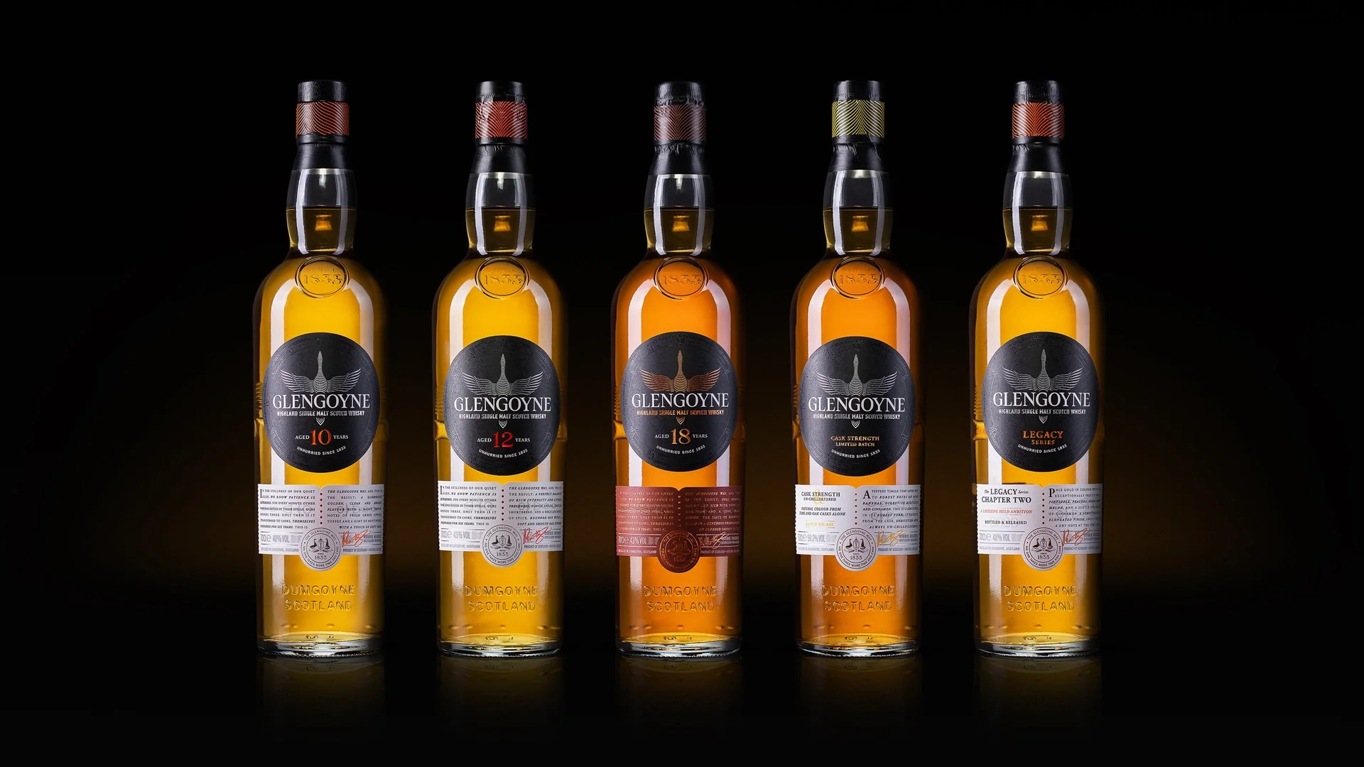
The product story begins on the secondary packaging where the name ‘Glengoyne’ is explained along with its relationship to the core design motifs of the flying goose and handless clock face:

AGED IN THE GLEN OF THE GEESE
Migrating flocks of geese give our home its name. Glen of the geese. Or in Gaelic, Glen Guin.
But our guests have inspired more than just our whisky’s name. We’re proud to be the slowest whisky distiller in Scotland and, like those geese, we’re guided by an unwavering clarity of purpose. Sometimes, the right way is the long way.
On the front of the bottle itself, the story continues with a deeper dive into the distillation process. The copy was written to seamlessly segue into the tasting notes which are unique to each variant.

Alongside the packaging copy, I also extensively re-wrote the Glengoyne website. Elements from the history and special bottling sections were incorporated into booklets and packaging for prestige editions of the whisky.
